01 / 03
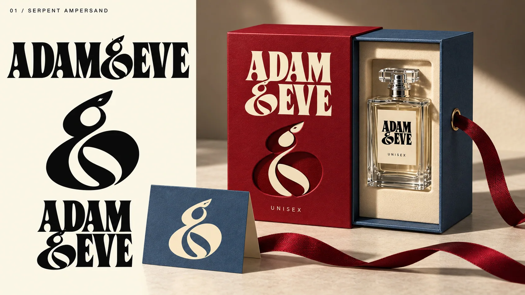
Serpent ampersand
The serpent connects the two names within the mark, then moves onto bottle and packaging.
Branding exploration / 2026
An exploration of different directions for Adam & Eve—from minimal to highly figurative.
The idea / 01
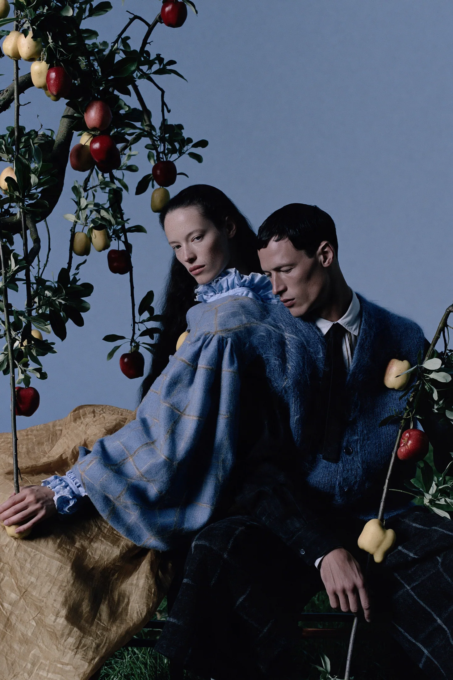
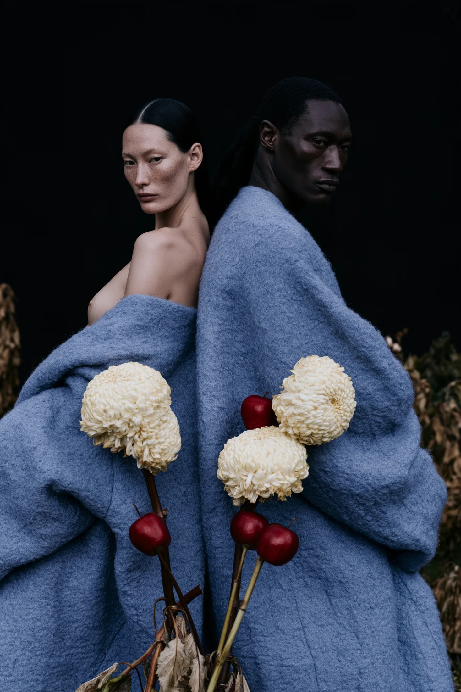
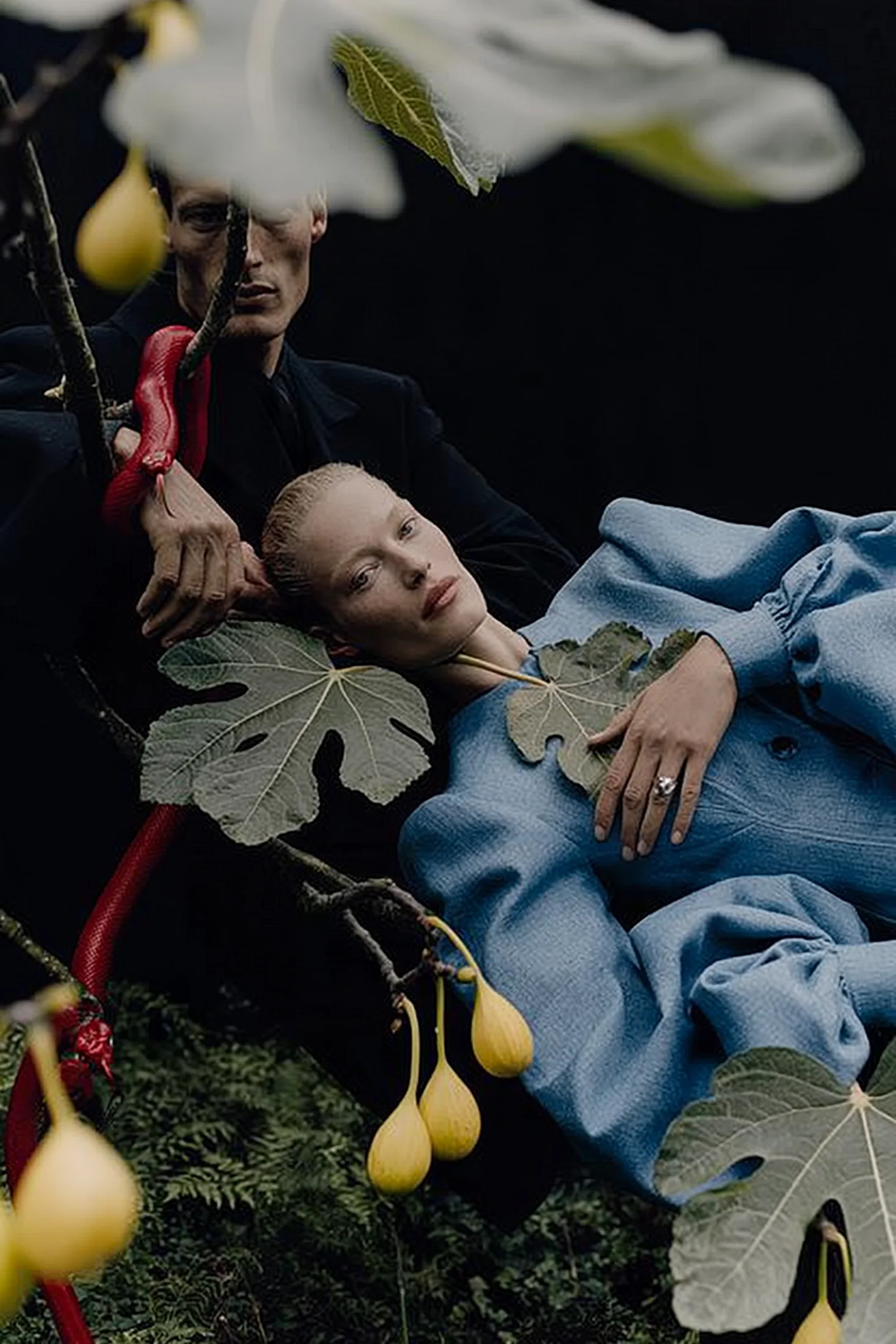
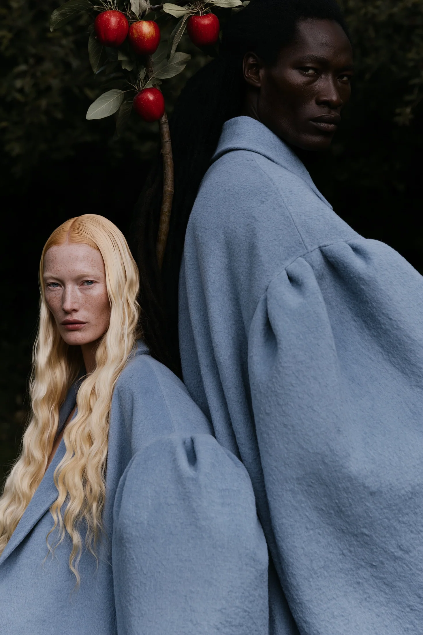
An imagined unisex fragrance identity. Garden imagery, blue tailoring, fruit and glass set the campaign mood; packaging and placement studies test how the world could travel.
Art direction / 02
Casting, gesture and botanical symbols explored as a visual family.
Product image test / 03
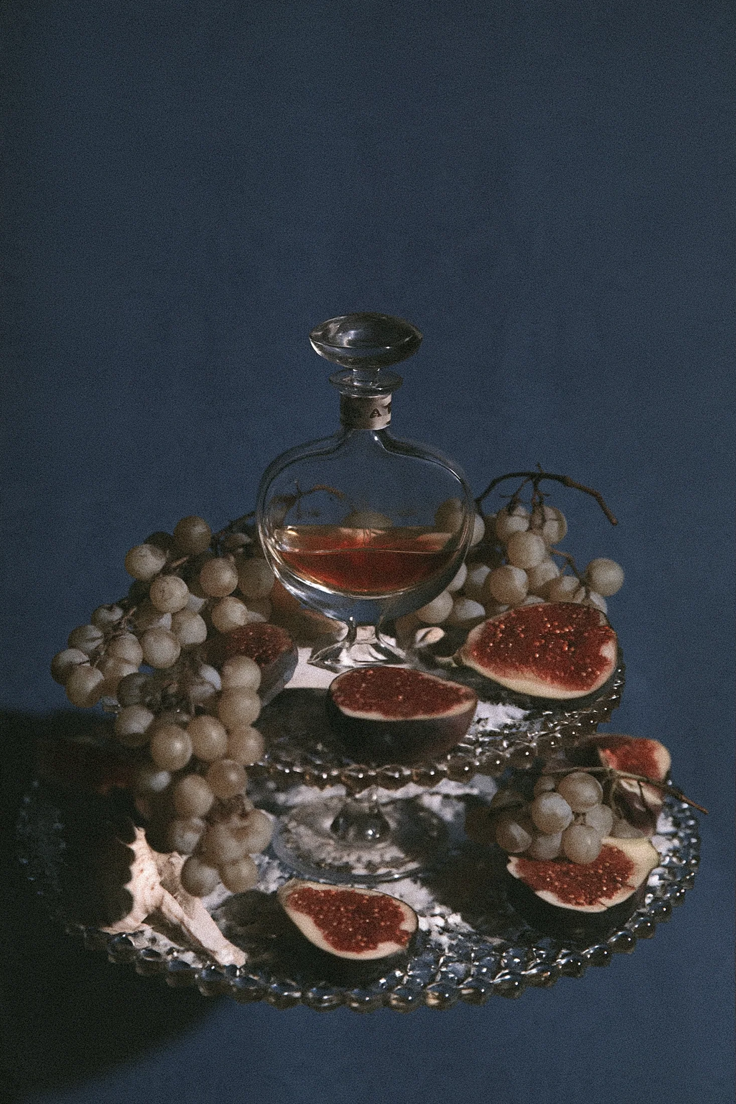
The fragrance still life carries the orchard into a quieter, more tactile register.
Brand identity / 04
Three open design tests for a symbol that can live in type, on an object or across a complete packaging system.
The serpent connects the two names within the mark, then moves onto bottle and packaging.
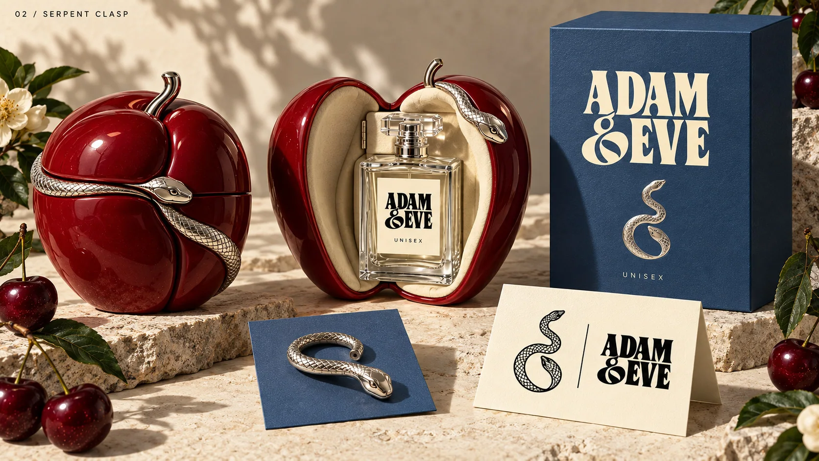
A sculptural silver detail turns the fruit-shaped case into a keepsake object.
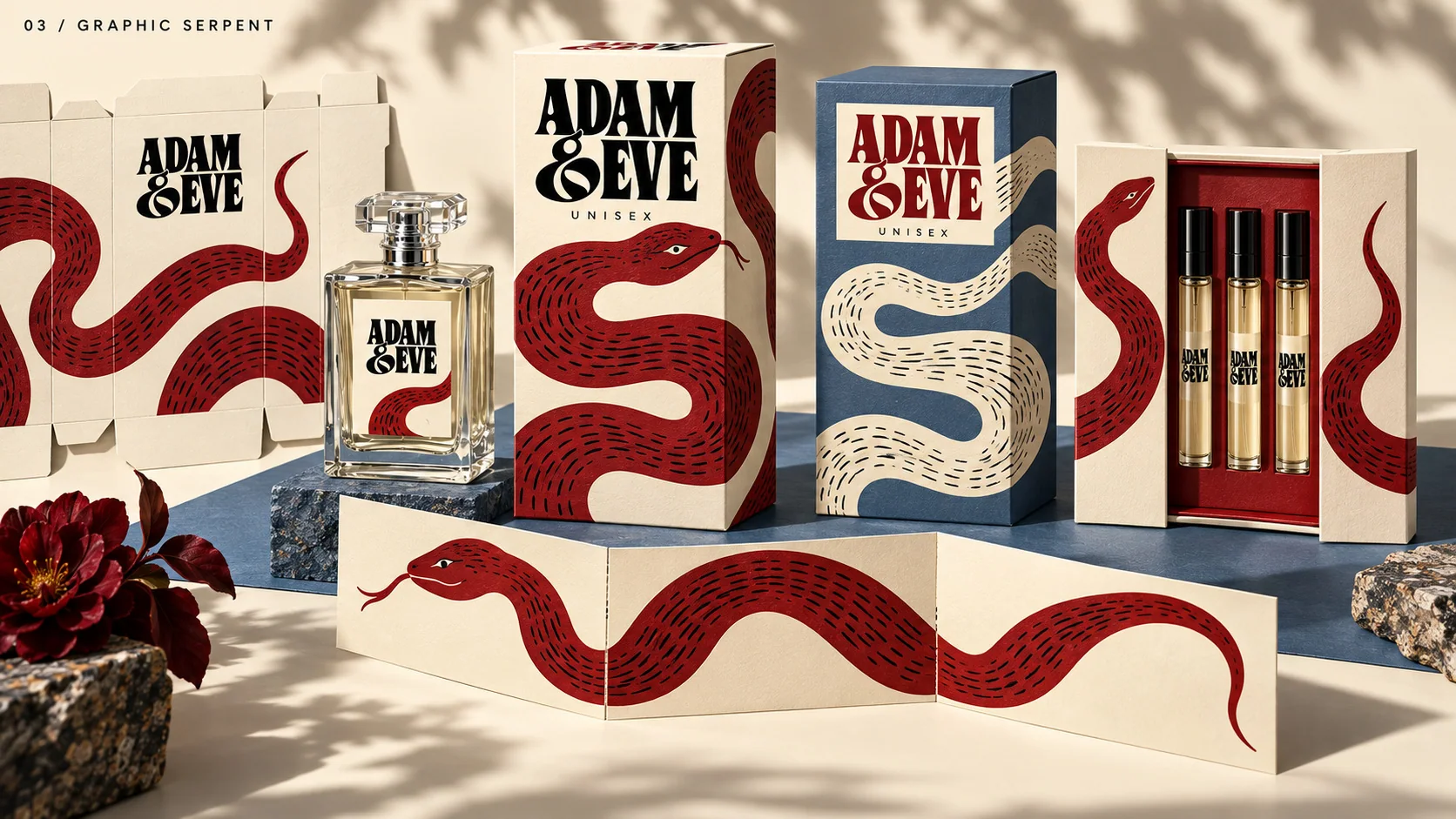
A drawn motif travels across the carton, unfolded paper and scent cards.
Application tests / 05
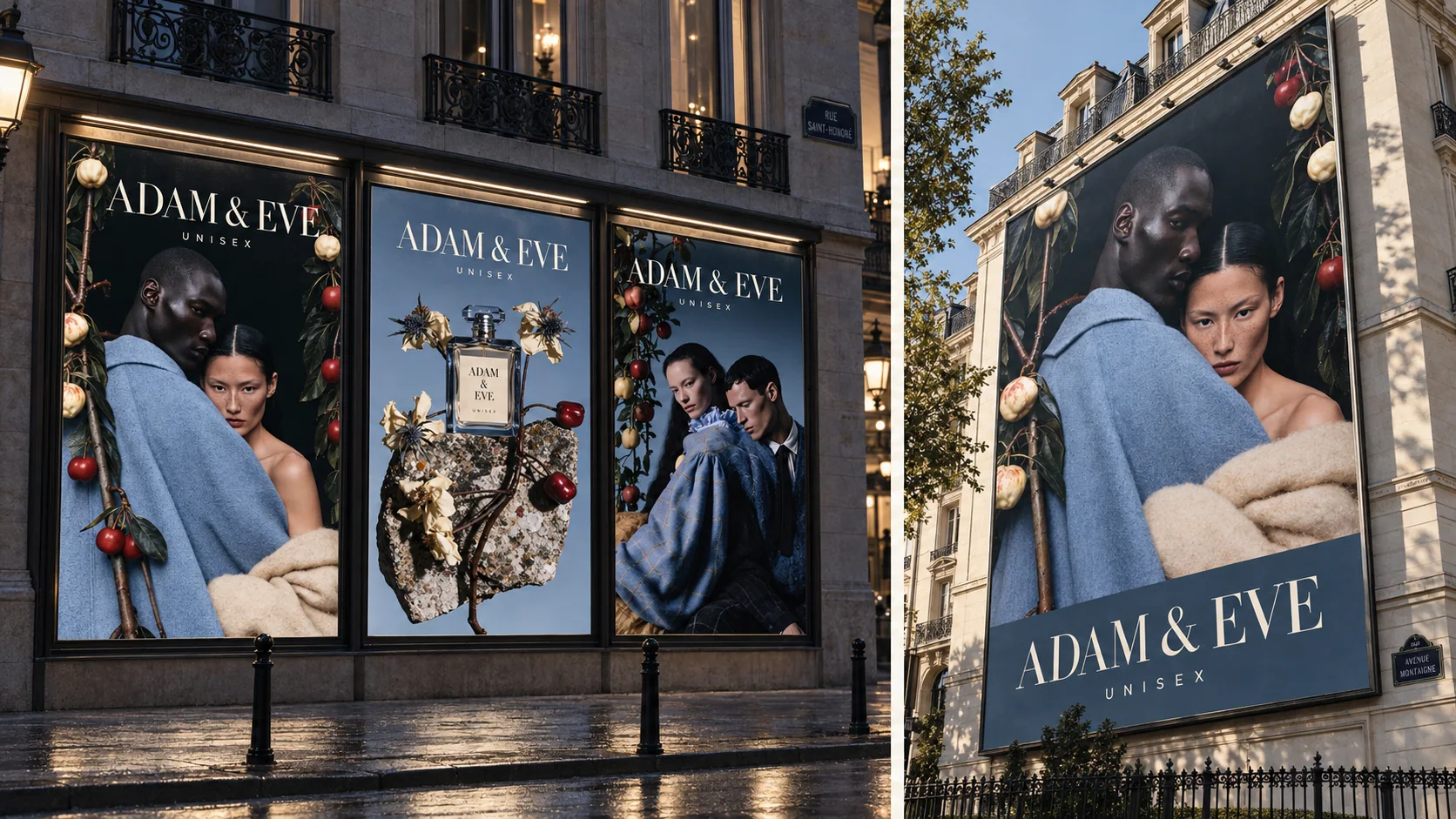
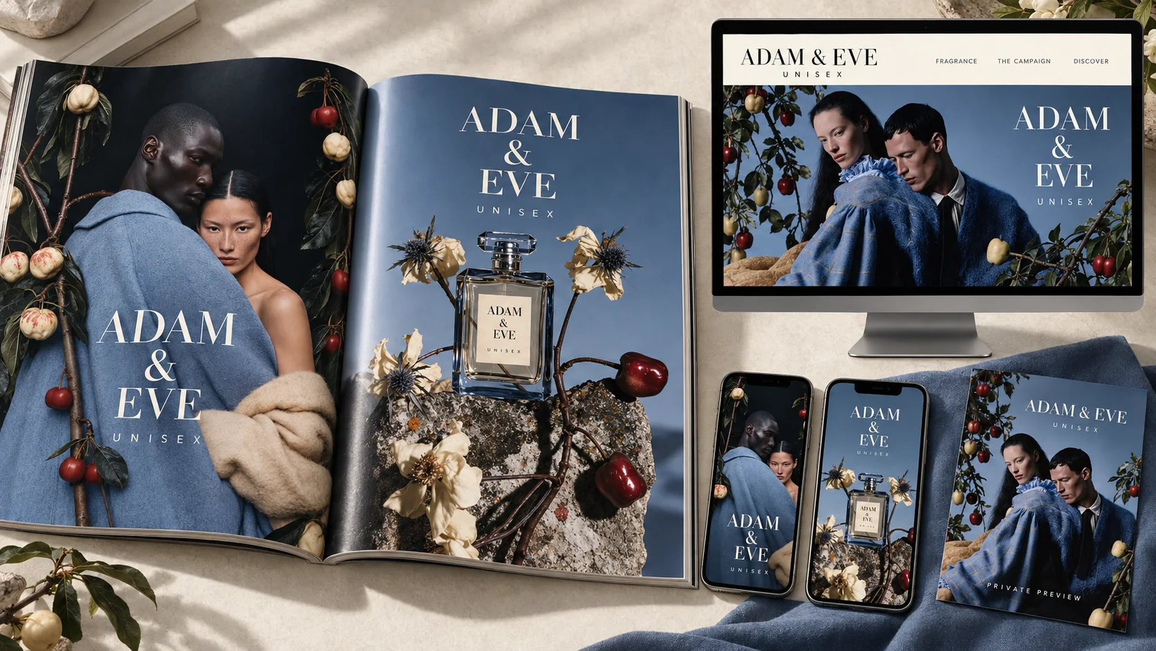
Placement studies take the campaign from the street to print and digital touchpoints.